07.10.12
The proverb “Eyes are the window to the soul,” offers a guidepost of sorts about human nature. Look deep enough, and you’ll find a person’s true essence, or at a minimum, intention.
It’s like that in branding, where the package and label together create the window to the soul of the brand. Some truly define the brand essence, while others only hint at it.
For AQUAÇAI natural artesian water, quality and purity make up its soul, the origins of which date back three million years. That was when the artesian aquifer that is this water’s source began forming – when the Isthmus of Panama dramatically emerged from the ocean to form the narrow land bridge joining the North and South American continents. And as a point of brand exclusivity, AQUAÇAI artesian water is produced, bottled and shipped directly from its source – an aquifer cradled deep beneath 1,400 acres of the Panamanian Açai Rainforest, along the Continental Divide.
“For millions of years, AQUAÇAI water has been filtered, collected and preserved in this vast artesian aquifer,” says Michael Horth, CEO with Eurofusion, the brand owner. “The quality and purity of our water is the heart of what the brand is all about. We needed the brand design to reflect this. But we also wanted to establish a premium positioning that would be accepted by high-end consumers.”
The AQUAÇAI name comes from combining the word aqua and the name of the acai palm, which is known for its fruit. Eurofusion is based in Panama City, Panama, in Central America, and launched the AQUAÇAI brand in 2008. Moxie TM, an international brand and package design firm with offices in New York and Miami, was given the assignment of creating the brand identity and leveraging the value of purity.
“We used design elements that cross cultural borders,” says Tammy Vaserstein, creative principal, Moxie TM. “The brand design connects the purity of the water source and premium quality of the brand, making it attractive to a global audience.”
For AQUAÇAI water, the label and package show the value of purity.
AQUAÇAI is available in three sizes of PET bottles: 1 liter, 591 ml and 354 ml. Each bottle has a prime label and back label of pressure-sensitive film, clear for the prime and white for the back. This two-part label is a departure from the wrap and cut-and-stack labels used by many of the brand’s competitors.
Eurofusion wanted a package that would deliver shelf impact and a premium positioning, combined with high-speed bottling capabilities and a level of brand protection. For that, they turned to Fasson pressure-sensitive film from Avery Dennison.
“We chose pressure sensitive labels as the best option due to their high print and graphics capabilities,” says Lino Vásquez, plant manager. “The complex graphics of our AQUAÇAI labels make them somewhat more difficult to imitate, which is especially important in markets where pirating of brands is perceived as common practice.”
The labels were produced by Brook & Whittle Limited, North Branford, CT, USA. The prime and back labels are Fasson Global Co-Ex, a matte clear film of 2 mil. The prime label was UV flexo and screen-printed in 4-color process, plus a white screen, two spot blues, silver and silver foil. The back label was UV flexo and screen-printed inside with 4-color process, and printed outside with 4-color process, two whites, and spot blue.
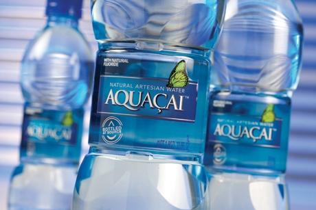
Silver foil accents on the white serif logotype on the prime label cues a sense of reflecting water, and adds an element of strong dimensional highlights that work in conjunction with the drop-shadows of each letter to create visual depth. The logotype floats in a gradient sea of blue. A single, silver rule line at the top and bottom of the blue field draws attention to the AQUAÇAI name. A signature green butterfly icon at the top right side appears to flutter into the visual frame, half over the blue field.
Additional visual depth of the prime label comes from the inside of the back label, which holds an image of a waterfall. The outside of the back label contains brand identity and positioning copy, the UPC, and minerals content information.
“AQUAÇAI is truly a high-end product and Eurofusion wanted a complete package that would firmly establish the brand above and beyond the competition,” adds Steve Stewart, president of Brook & Whittle. “The clear-on-clear pressure sensitive film and the brand design work together to deliver differentiation at the shelf in a way that really sets the product apart.”
In addition to delivering shelf impact, the polyolefin film labels allowed higher processing speeds compared to other labeling technologies. The AQUAÇAI bottling facility is 100,000 square feet, and fully automated. Stainless steel pipelines carry the water from the artesian aquifer directly to the plant where it is immediately bottled, capped and sealed under environmentally controlled conditions without any human intervention.
The PET bottles are blown on site and produced in real-time to the bottling process, with a normal production speed of 36,000 bottles per hour. The bottles are slightly warm when they reach the labeling station, which makes them dimensionally unstable.
“Basically, the bottles change shape slightly as they fully cool after filling and labeling,” Stewart says. “So, we had to make sure the label and adhesive would move with the bottle as it cools. The Fasson Global Co-Ex is flexible enough to move without wrinkling, curling or lifting. And the adhesive is a key part of the solution as well.”
Engineers from Avery Dennison and Krones, which supplied the labeling equipment, were highly involved with on-site testing at the bottling facility in Panama.
“Avery Dennison and Brook & Whittle worked with us in trialing different substrates and adhesives to find the right combination for our application,” Vásquez says. “And because AQUAÇAI has a two-year shelf life, it was imperative the labels remain intact for at least this amount of time. Accelerated age tests at Avery Dennison’s labs in Mentor, OH, USA, confirmed the label lifecycle durability.”
The artesian aquifer naturally filters and purifies the AQUAÇAI water, giving it a consistent balance of minerals and its refreshingly smooth taste. The water is infused with naturally occurring calcium, potassium and silica. More than 125 sources of natural spring water flow from the surrounding mountains and rainforest to recharge the aquifer. The water percolates under tremendous geological pressure, making it the purest of waters. AQUAÇAI is one of only a few bottled waters that can claim the distinction of providing pure, all-natural artesian water.
The commitment of Eurofusion to protect the natural resources that help define the AQUAÇAI brand are evident throughout the entire operation. The bottling facility conducts real-time monitoring of the aquifer level. And the quality assurance program exceeds all internationally recognized standards established by the International Bottled Water Association and the World Health Organization.
“Our commitment and reverence for the natural resources of the Panamanian Aç––ai Rainforest encompasses everything we do at each step in taking our product to the global market,” Shani Gerschfeld, marketing manager, says. “It’s reflected in our brand identity and overall label quality. It can even be found in our bottle, at the base of which is a molded relief of a Panamanian mountain in the rainforest.”
It’s like that in branding, where the package and label together create the window to the soul of the brand. Some truly define the brand essence, while others only hint at it.
For AQUAÇAI natural artesian water, quality and purity make up its soul, the origins of which date back three million years. That was when the artesian aquifer that is this water’s source began forming – when the Isthmus of Panama dramatically emerged from the ocean to form the narrow land bridge joining the North and South American continents. And as a point of brand exclusivity, AQUAÇAI artesian water is produced, bottled and shipped directly from its source – an aquifer cradled deep beneath 1,400 acres of the Panamanian Açai Rainforest, along the Continental Divide.
“For millions of years, AQUAÇAI water has been filtered, collected and preserved in this vast artesian aquifer,” says Michael Horth, CEO with Eurofusion, the brand owner. “The quality and purity of our water is the heart of what the brand is all about. We needed the brand design to reflect this. But we also wanted to establish a premium positioning that would be accepted by high-end consumers.”
The AQUAÇAI name comes from combining the word aqua and the name of the acai palm, which is known for its fruit. Eurofusion is based in Panama City, Panama, in Central America, and launched the AQUAÇAI brand in 2008. Moxie TM, an international brand and package design firm with offices in New York and Miami, was given the assignment of creating the brand identity and leveraging the value of purity.
“We used design elements that cross cultural borders,” says Tammy Vaserstein, creative principal, Moxie TM. “The brand design connects the purity of the water source and premium quality of the brand, making it attractive to a global audience.”
For AQUAÇAI water, the label and package show the value of purity.
AQUAÇAI is available in three sizes of PET bottles: 1 liter, 591 ml and 354 ml. Each bottle has a prime label and back label of pressure-sensitive film, clear for the prime and white for the back. This two-part label is a departure from the wrap and cut-and-stack labels used by many of the brand’s competitors.
Eurofusion wanted a package that would deliver shelf impact and a premium positioning, combined with high-speed bottling capabilities and a level of brand protection. For that, they turned to Fasson pressure-sensitive film from Avery Dennison.
“We chose pressure sensitive labels as the best option due to their high print and graphics capabilities,” says Lino Vásquez, plant manager. “The complex graphics of our AQUAÇAI labels make them somewhat more difficult to imitate, which is especially important in markets where pirating of brands is perceived as common practice.”
The labels were produced by Brook & Whittle Limited, North Branford, CT, USA. The prime and back labels are Fasson Global Co-Ex, a matte clear film of 2 mil. The prime label was UV flexo and screen-printed in 4-color process, plus a white screen, two spot blues, silver and silver foil. The back label was UV flexo and screen-printed inside with 4-color process, and printed outside with 4-color process, two whites, and spot blue.
Silver foil accents on the white serif logotype on the prime label cues a sense of reflecting water, and adds an element of strong dimensional highlights that work in conjunction with the drop-shadows of each letter to create visual depth. The logotype floats in a gradient sea of blue. A single, silver rule line at the top and bottom of the blue field draws attention to the AQUAÇAI name. A signature green butterfly icon at the top right side appears to flutter into the visual frame, half over the blue field.
Additional visual depth of the prime label comes from the inside of the back label, which holds an image of a waterfall. The outside of the back label contains brand identity and positioning copy, the UPC, and minerals content information.
“AQUAÇAI is truly a high-end product and Eurofusion wanted a complete package that would firmly establish the brand above and beyond the competition,” adds Steve Stewart, president of Brook & Whittle. “The clear-on-clear pressure sensitive film and the brand design work together to deliver differentiation at the shelf in a way that really sets the product apart.”
In addition to delivering shelf impact, the polyolefin film labels allowed higher processing speeds compared to other labeling technologies. The AQUAÇAI bottling facility is 100,000 square feet, and fully automated. Stainless steel pipelines carry the water from the artesian aquifer directly to the plant where it is immediately bottled, capped and sealed under environmentally controlled conditions without any human intervention.
The PET bottles are blown on site and produced in real-time to the bottling process, with a normal production speed of 36,000 bottles per hour. The bottles are slightly warm when they reach the labeling station, which makes them dimensionally unstable.
“Basically, the bottles change shape slightly as they fully cool after filling and labeling,” Stewart says. “So, we had to make sure the label and adhesive would move with the bottle as it cools. The Fasson Global Co-Ex is flexible enough to move without wrinkling, curling or lifting. And the adhesive is a key part of the solution as well.”
Engineers from Avery Dennison and Krones, which supplied the labeling equipment, were highly involved with on-site testing at the bottling facility in Panama.
“Avery Dennison and Brook & Whittle worked with us in trialing different substrates and adhesives to find the right combination for our application,” Vásquez says. “And because AQUAÇAI has a two-year shelf life, it was imperative the labels remain intact for at least this amount of time. Accelerated age tests at Avery Dennison’s labs in Mentor, OH, USA, confirmed the label lifecycle durability.”
The artesian aquifer naturally filters and purifies the AQUAÇAI water, giving it a consistent balance of minerals and its refreshingly smooth taste. The water is infused with naturally occurring calcium, potassium and silica. More than 125 sources of natural spring water flow from the surrounding mountains and rainforest to recharge the aquifer. The water percolates under tremendous geological pressure, making it the purest of waters. AQUAÇAI is one of only a few bottled waters that can claim the distinction of providing pure, all-natural artesian water.
The commitment of Eurofusion to protect the natural resources that help define the AQUAÇAI brand are evident throughout the entire operation. The bottling facility conducts real-time monitoring of the aquifer level. And the quality assurance program exceeds all internationally recognized standards established by the International Bottled Water Association and the World Health Organization.
“Our commitment and reverence for the natural resources of the Panamanian Aç––ai Rainforest encompasses everything we do at each step in taking our product to the global market,” Shani Gerschfeld, marketing manager, says. “It’s reflected in our brand identity and overall label quality. It can even be found in our bottle, at the base of which is a molded relief of a Panamanian mountain in the rainforest.”
