Jack Kenny09.07.16
Label converters, by virtue of their position between the brand owner and the end user, are well placed to be advisers to their clients. Substrate types and qualities, color challenges, adhesive properties, digital vs. analog – all are subjects upon which the printer can weigh-in during discussions with the customer. All good printers help educate clients, and those who contribute superlative in-depth knowledge and expertise are the ones who command the most attention.
Converters who keep an eye on the world beyond labels – the larger world of packaging – can offer even more ideas to the brand owners. One of these is package design. At first, it might seem as though the subject is best left to the customer, but it is not unknown for clients to lend an ear to the wisdom of a trusted vendor.
Consider Consolidated Label, the large converter based in Florida: On its website, the company features an article titled “7 Reasons to Update Your Packaging Labels.” Considering that this is the company that has won TLMI’s Eugene Singer Award for best-managed label company for 14 consecutive years, it might be worth listening to what they have to say.
Consolidated’s advice includes such points as expanding the brand, adding new products, market changes, staying fresh and relevant, giving packaging some pop, refining your message and environmental considerations. The company offers assistance in connecting with talented label designers who understand the requirements of print production.
Before going a bit deeper into the various aspects of package and label design change, it might be best to make note of some cautionary advice. The first is that a brand owner should have a fact-based reason for making such a change.
In a recent issue of Forbes, marketing professor Priya Raghubir of NYU’s Stern School of Business was quoted as saying, “Not that many CPG marketers will admit to it, but I would bet that many packaging changes are made (similar to changes in advertising themes) simply because the marketer has got bored of the old design and wants to do something new.”
His thoughts were seconded by David Mothersbaugh, head of the marketing department at the University of Alabama: “Change just to change can be bad. Successful brands have loyal followers who watch what they do. Any change, including packaging, can leave them confused or feeling negative about the brand if the change doesn’t make sense to them or resonate with their needs.”
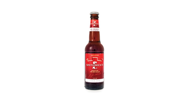
Example: A couple of years ago, Irish brewer Smithwick’s changed the packaging for its ale from green and gold to all red. I don’t know what the thinking was behind the change, but it left many a consumer standing in the aisles, shaking their heads and shrugging their shoulders, some leaving empty handed, unable to find their beverage. (At the same time, the brewer reduced the bottle size from 12 ounces to 11.2 ounces, causing further annoyance.)
Which brings us to the second warning: End users do not always embrace change. Many will find it acceptable but they won’t tell you. Those who do speak up are most often the complainers. Remember that shoppers are conditioned to scan store shelves to recognize colors, shapes and containers, and typographical elements. If a package design is radical in any or all of these areas, be prepared for some blowback.
Large consumer product producers employ their own designers, so a converter won’t be called on to consult on a label for Kraft Foods or Coca-Cola. But the marketplace is riddled with smaller players who make up a significant proportion of the workload of an average label printer. These firms might be more open to ideas from professionals in the packaging field.
Market changes, consumer trends
Trends in consumer behavior patterns are high on the list of priorities for planning a redesign. Lately, we cannot help but hear Millennial this, Millennial that, about how large and powerful this group is, born roughly between 1980 and 2000. They want different type, they want smaller portions, they eat on the go, they’re more environmentally conscious. No matter what era it is, human behavior will be in transition, and it will be measurable. Paying close attention to consumption patterns among goods of every kind – foods, beverages, cosmetics, cars, clothing – is necessary to gauge the forces that will have an impact on your products.
Your specific market might be changing, or have already changed, which is an indication that a packaging makeover might give your portfolio a boost. You might have a new competitor, or more than one; there may be changes taking place within a product category that you should emphasize; or there could be some new movement in retail channels that are worth exploring and exploiting. All of these are worth weighing as you contemplate a new packaging wardrobe.
Several other factors can have an effect on the decision to redesign. One is material changes. Perhaps it’s time to shift to a different type of label such as shrink sleeve or in-mold. Maybe you’ve decided on a different shape and material for the container. A new substrate has captured your attention, and it could solve some issues you have in production or with end-use. Functional and material changes are many, and strongly influence packaging overall.
Regulatory aspects are another influence. With the pending expansion of nutrition facts panels on food and beverage products in the US, some brand marketers will be compelled to make changes to labels in order to properly accommodate the additional information.
Environmental concerns also come into play. Is the label material as environmentally friendly as possible? What are the options? What is the life history of the container? Perhaps a smaller package or label will reduce the impact on waste. It will certainly influence the bottom line.
Every company has a brand strategy, and the packaging must reflect that. In the Forbes article previously mentioned, Procter & Gamble’s Phil Duncan, the global design officer, had this to say: “When considering a change, be strategy-led and consumer-informed. The consumer is exceptional at telling you what they don’t like – but are often cold to something new, as it’s unfamiliar. Listen to the consumer as you learn about your new package designs, but be led by your vision and your brand strategy.
“It’s vital to understand the brand equities and assets you would like to carry forward – those seen as iconic or inseparable to the brand. Monitor how far, or if at all, these assets should change as you consider new package designs.
“Done best, packaging changes aren’t in isolation of a holistic, well-crafted and executed brand plan, which all together make an impact on the business.”
Distinction and simplicity
It goes without saying that every brand must be distinctive, and must stand out among its competitors in a visual and tactile manner. It doesn’t need to shout (it shouldn’t, really), but it does need to draw the viewer’s attention. This is where design experts and focus groups will help.
Simple is beautiful. And in packaging, it is effective. Aggressive color, motion and graphics might be fine for children’s toys, but a basic, clear, elegant message will come through with greater strength.
Finally, reward yourself by taking five or 10 minutes out of your day to explore the history of Campbell’s soup can labels. The current design was conceived and executed in 1898, and in a few years had settled on a pattern that has both changed with the years and stayed the same. How it has done so is a wonder to behold and a lesson to be appreciated.
The author is president of Jack Kenny Media, a communications firm specializing in the packaging industry, and is the former editor of L&NW. He can be reached at jackjkenny@gmail.com.
Converters who keep an eye on the world beyond labels – the larger world of packaging – can offer even more ideas to the brand owners. One of these is package design. At first, it might seem as though the subject is best left to the customer, but it is not unknown for clients to lend an ear to the wisdom of a trusted vendor.
Consider Consolidated Label, the large converter based in Florida: On its website, the company features an article titled “7 Reasons to Update Your Packaging Labels.” Considering that this is the company that has won TLMI’s Eugene Singer Award for best-managed label company for 14 consecutive years, it might be worth listening to what they have to say.
Consolidated’s advice includes such points as expanding the brand, adding new products, market changes, staying fresh and relevant, giving packaging some pop, refining your message and environmental considerations. The company offers assistance in connecting with talented label designers who understand the requirements of print production.
Before going a bit deeper into the various aspects of package and label design change, it might be best to make note of some cautionary advice. The first is that a brand owner should have a fact-based reason for making such a change.
In a recent issue of Forbes, marketing professor Priya Raghubir of NYU’s Stern School of Business was quoted as saying, “Not that many CPG marketers will admit to it, but I would bet that many packaging changes are made (similar to changes in advertising themes) simply because the marketer has got bored of the old design and wants to do something new.”
His thoughts were seconded by David Mothersbaugh, head of the marketing department at the University of Alabama: “Change just to change can be bad. Successful brands have loyal followers who watch what they do. Any change, including packaging, can leave them confused or feeling negative about the brand if the change doesn’t make sense to them or resonate with their needs.”
Example: A couple of years ago, Irish brewer Smithwick’s changed the packaging for its ale from green and gold to all red. I don’t know what the thinking was behind the change, but it left many a consumer standing in the aisles, shaking their heads and shrugging their shoulders, some leaving empty handed, unable to find their beverage. (At the same time, the brewer reduced the bottle size from 12 ounces to 11.2 ounces, causing further annoyance.)
Which brings us to the second warning: End users do not always embrace change. Many will find it acceptable but they won’t tell you. Those who do speak up are most often the complainers. Remember that shoppers are conditioned to scan store shelves to recognize colors, shapes and containers, and typographical elements. If a package design is radical in any or all of these areas, be prepared for some blowback.
Large consumer product producers employ their own designers, so a converter won’t be called on to consult on a label for Kraft Foods or Coca-Cola. But the marketplace is riddled with smaller players who make up a significant proportion of the workload of an average label printer. These firms might be more open to ideas from professionals in the packaging field.
Market changes, consumer trends
Trends in consumer behavior patterns are high on the list of priorities for planning a redesign. Lately, we cannot help but hear Millennial this, Millennial that, about how large and powerful this group is, born roughly between 1980 and 2000. They want different type, they want smaller portions, they eat on the go, they’re more environmentally conscious. No matter what era it is, human behavior will be in transition, and it will be measurable. Paying close attention to consumption patterns among goods of every kind – foods, beverages, cosmetics, cars, clothing – is necessary to gauge the forces that will have an impact on your products.
Your specific market might be changing, or have already changed, which is an indication that a packaging makeover might give your portfolio a boost. You might have a new competitor, or more than one; there may be changes taking place within a product category that you should emphasize; or there could be some new movement in retail channels that are worth exploring and exploiting. All of these are worth weighing as you contemplate a new packaging wardrobe.
Several other factors can have an effect on the decision to redesign. One is material changes. Perhaps it’s time to shift to a different type of label such as shrink sleeve or in-mold. Maybe you’ve decided on a different shape and material for the container. A new substrate has captured your attention, and it could solve some issues you have in production or with end-use. Functional and material changes are many, and strongly influence packaging overall.
Regulatory aspects are another influence. With the pending expansion of nutrition facts panels on food and beverage products in the US, some brand marketers will be compelled to make changes to labels in order to properly accommodate the additional information.
Environmental concerns also come into play. Is the label material as environmentally friendly as possible? What are the options? What is the life history of the container? Perhaps a smaller package or label will reduce the impact on waste. It will certainly influence the bottom line.
Every company has a brand strategy, and the packaging must reflect that. In the Forbes article previously mentioned, Procter & Gamble’s Phil Duncan, the global design officer, had this to say: “When considering a change, be strategy-led and consumer-informed. The consumer is exceptional at telling you what they don’t like – but are often cold to something new, as it’s unfamiliar. Listen to the consumer as you learn about your new package designs, but be led by your vision and your brand strategy.
“It’s vital to understand the brand equities and assets you would like to carry forward – those seen as iconic or inseparable to the brand. Monitor how far, or if at all, these assets should change as you consider new package designs.
“Done best, packaging changes aren’t in isolation of a holistic, well-crafted and executed brand plan, which all together make an impact on the business.”
Distinction and simplicity
It goes without saying that every brand must be distinctive, and must stand out among its competitors in a visual and tactile manner. It doesn’t need to shout (it shouldn’t, really), but it does need to draw the viewer’s attention. This is where design experts and focus groups will help.
Simple is beautiful. And in packaging, it is effective. Aggressive color, motion and graphics might be fine for children’s toys, but a basic, clear, elegant message will come through with greater strength.
Finally, reward yourself by taking five or 10 minutes out of your day to explore the history of Campbell’s soup can labels. The current design was conceived and executed in 1898, and in a few years had settled on a pattern that has both changed with the years and stayed the same. How it has done so is a wonder to behold and a lesson to be appreciated.
The author is president of Jack Kenny Media, a communications firm specializing in the packaging industry, and is the former editor of L&NW. He can be reached at jackjkenny@gmail.com.