09.07.15
Earlier this year, Anheuser-Busch InBev, the world’s largest brewing group, launched three new premium Beck’s beers: Pale Ale, 1873 Pils and Amber Lager. Constantia Flexibles Labels Division has supported the relaunch with rotrogravure-printed paper labels incorporating UV mark recognition.
All three labels are printed on highly-refined white paper to attract the customer’s attention. The team also used a varnish that produces a matte gloss effect, giving the bottle a premium appearance. Additionally, the paper neck labels are equipped with another special varnish that simplifies the handling of returnable empties by UV mark recognition.
The letterings on the Beck’s beer labels “full-bodied and hoppy,” “aromatic and smooth” or “traditionally fresh” brightly pop up on the different beer types in different colors.
Foiled
Constantia Flexibles has received an Alufoil Trophy for Chang Beer and its next generation neck foil. There were 57 entries, and the

The Alufoil Trophy winner from Constantia Flexibles
judges ultimately settled on 12 winners.
According to the Alufoil Trophy jury: “Constantia Flexibles Labels Division has created a remarkably thin neck foil label for Chang Beer which uses an 8.8my, soft tampered, aluminium foil alloy. This not only offers material savings, but also downstream advantages during the wash process of returnable glass bottles.”
Since the 1990s, the thickness of foil has continually reduced from 13my down to 9.5my. Now, Constantia Flexibles Labels Division has further reduced it to 8.8my with Chang Beer’s neck label.
“The Thai Beverage Company takes environmental issues seriously and has developed sustainability programs throughout the value chain,” explains Pisanu Vichiensanth, director and executive vice president – technology and engineering. “It is our pleasure to be a part of this initiative program with Constantia to pioneer such a sustainability development to the aluminium foil industry.”
In addition to material savings of 8%, the new neck foil has a positive impact on wastewater used during the returned bottle cleaning process. The thinner foil completely dissolves in the caustic bath, extending the caustic wash efficiency by up to 10%. This leads to lower hydrogen emissions and less heat dissipation from the washer.
“Material efficiency is a fundamental part of our and our customers’ business focus,” comments Gerd Blecken, head of R&D at Constantia Flexibles Labels Division. “From a business perspective, this Alufoil Trophy emphasizes the importance of sustainability, even in a niche market such as aluminium bottle neck foil usage.”
Keg can 2.0
How do you rejuvenate iconic packaging like Heineken’s trademark “keg” can? With the funky new “Groovy Embossed Can,” according to Heineken and Ball Packaging Europe, who collaboratively developed this design in response to Heineken’s desire to reenergize the brand’s shelf presence in the competitive retail market.
With grooved edges running around its entire body, the distinctive new 33-cl can offers consumers an enhanced tactile experience that also provides its handler a stable grip on the chilled can. This unique new can from Ball is produced out of its Wrexham site and launched into the UK market in April 2015.
Mark van Iterson, global head of design at Heineken, explains: “With the design of our new ‘Groovy Embossed Can’ we are combining cutting-edge technology with a bold design statement to surprise and excite consumers in a category that’s sometimes seen as heritage driven. The fresh, iconic design expresses the progressive personality of the brand and gives increased impact and stopping power at the point-of-sale.”
Heineken’s main target group is open-minded young adults: modern lifestyle, very mobile and always up-to-date and curious. They like the can for its functional and portable qualities and because it’s cool and progressive.
Although the keg can had won much favor within this consumer base, Heineken recognized that the time was right to inject fresh energy into its packaging. The brand in turn approached its long-term partners at Ball Packaging Europe to develop this new solution.
During the development phase, the question was raised, “How do we take an iconic brand and its signature packaging to a level that effectively prompts the retail consumer to act?”
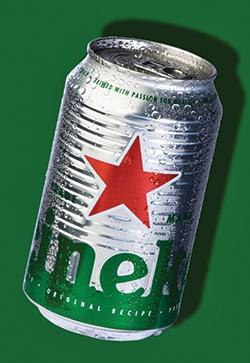
The new Heineken “Groovy Embossed” keg Can
“One of the challenges the team faced in development was creating a new look within the parameters of the embossing and debossing technology without compromising Heineken’s distinctive and powerful design elements – aspects which are obviously key to on-shelf product recognition,” says John Reed, commercial product manager at Ball Packaging Europe. “We wanted to include a significant amount of debossed features in the design in order to give the can a unique look without compromising the structural integrity of the package.”
The unique solution was to create a horizontally grooved can. To realize the full visual potential of the design, several color options were tested before choosing to leave the bulk of the can’s surface unprinted, relying on the natural reflective qualities of the metal to create a compelling visual effect. Fresh and genuine.
“In the race to grab consumer attention, our trials showed that the best approach was not to overwhelm the can with color. Perhaps counterintuitively, embossing and debossing over color can sometimes detract from visual impact,” Reed explains. “That didn’t mean compromising the iconic Heineken green color scheme with the distinctive red star. The effects achieved by the technology ensure that the ‘Groovy Embossed Can’ generates powerful on-shelf impact while continuing to evoke the spirit of the Heineken brand.
“Special products like this are particularly beneficial in markets that rely heavily on packaging to directly communicate with consumers,” Reed continues. “Thanks to this joint team approach, we have given the Heineken can a special look and tactile experience that will get people talking. That can only be good thing."
All three labels are printed on highly-refined white paper to attract the customer’s attention. The team also used a varnish that produces a matte gloss effect, giving the bottle a premium appearance. Additionally, the paper neck labels are equipped with another special varnish that simplifies the handling of returnable empties by UV mark recognition.
The letterings on the Beck’s beer labels “full-bodied and hoppy,” “aromatic and smooth” or “traditionally fresh” brightly pop up on the different beer types in different colors.
Foiled
Constantia Flexibles has received an Alufoil Trophy for Chang Beer and its next generation neck foil. There were 57 entries, and the
The Alufoil Trophy winner from Constantia Flexibles
According to the Alufoil Trophy jury: “Constantia Flexibles Labels Division has created a remarkably thin neck foil label for Chang Beer which uses an 8.8my, soft tampered, aluminium foil alloy. This not only offers material savings, but also downstream advantages during the wash process of returnable glass bottles.”
Since the 1990s, the thickness of foil has continually reduced from 13my down to 9.5my. Now, Constantia Flexibles Labels Division has further reduced it to 8.8my with Chang Beer’s neck label.
“The Thai Beverage Company takes environmental issues seriously and has developed sustainability programs throughout the value chain,” explains Pisanu Vichiensanth, director and executive vice president – technology and engineering. “It is our pleasure to be a part of this initiative program with Constantia to pioneer such a sustainability development to the aluminium foil industry.”
In addition to material savings of 8%, the new neck foil has a positive impact on wastewater used during the returned bottle cleaning process. The thinner foil completely dissolves in the caustic bath, extending the caustic wash efficiency by up to 10%. This leads to lower hydrogen emissions and less heat dissipation from the washer.
“Material efficiency is a fundamental part of our and our customers’ business focus,” comments Gerd Blecken, head of R&D at Constantia Flexibles Labels Division. “From a business perspective, this Alufoil Trophy emphasizes the importance of sustainability, even in a niche market such as aluminium bottle neck foil usage.”
Keg can 2.0
How do you rejuvenate iconic packaging like Heineken’s trademark “keg” can? With the funky new “Groovy Embossed Can,” according to Heineken and Ball Packaging Europe, who collaboratively developed this design in response to Heineken’s desire to reenergize the brand’s shelf presence in the competitive retail market.
With grooved edges running around its entire body, the distinctive new 33-cl can offers consumers an enhanced tactile experience that also provides its handler a stable grip on the chilled can. This unique new can from Ball is produced out of its Wrexham site and launched into the UK market in April 2015.
Mark van Iterson, global head of design at Heineken, explains: “With the design of our new ‘Groovy Embossed Can’ we are combining cutting-edge technology with a bold design statement to surprise and excite consumers in a category that’s sometimes seen as heritage driven. The fresh, iconic design expresses the progressive personality of the brand and gives increased impact and stopping power at the point-of-sale.”
Heineken’s main target group is open-minded young adults: modern lifestyle, very mobile and always up-to-date and curious. They like the can for its functional and portable qualities and because it’s cool and progressive.
Although the keg can had won much favor within this consumer base, Heineken recognized that the time was right to inject fresh energy into its packaging. The brand in turn approached its long-term partners at Ball Packaging Europe to develop this new solution.
During the development phase, the question was raised, “How do we take an iconic brand and its signature packaging to a level that effectively prompts the retail consumer to act?”
The new Heineken “Groovy Embossed” keg Can
The unique solution was to create a horizontally grooved can. To realize the full visual potential of the design, several color options were tested before choosing to leave the bulk of the can’s surface unprinted, relying on the natural reflective qualities of the metal to create a compelling visual effect. Fresh and genuine.
“In the race to grab consumer attention, our trials showed that the best approach was not to overwhelm the can with color. Perhaps counterintuitively, embossing and debossing over color can sometimes detract from visual impact,” Reed explains. “That didn’t mean compromising the iconic Heineken green color scheme with the distinctive red star. The effects achieved by the technology ensure that the ‘Groovy Embossed Can’ generates powerful on-shelf impact while continuing to evoke the spirit of the Heineken brand.
“Special products like this are particularly beneficial in markets that rely heavily on packaging to directly communicate with consumers,” Reed continues. “Thanks to this joint team approach, we have given the Heineken can a special look and tactile experience that will get people talking. That can only be good thing."
