01.05.18
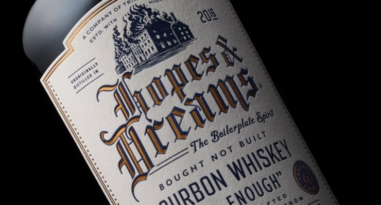
A hot stamping foil from brand enhancement specialist API is adding texture and sophistication to the bottle of an exciting new bourbon. Hopes & Dreams, which wittily satirizes stereotypical handcrafted whiskey marketing in its promotion, features API Copper Kettle foil on its vintage label.
Differentiating itself from other bourbon brands, Hopes & Dreams publicizes itself with such underwhelming pull-quotes as “Meh” and “It's good. Enough,” and is squarely aimed at millennials, as well as any whiskey drinkers who don't take themselves too seriously.
On the drink's Wild West-style label, the API hot stamping foil creates a subtly luxurious feel. It forms the “Hopes & Dreams” lettering, provides a double-line trim around the perimeter, and adds gleam to two sardonic seals of approval that, upon close inspection, boast “Unlimited release.”
"I selected the Copper Kettle foil because of its stand-out, gorgeous tone, which had an authenticity that paired nicely with the label design," says Chad Michael, whose studio designed the label. "As the entire brand is about a 'boilerplate' bourbon that has been 'machine-crafted,’ the glamour of the foil might seem ironic – but of course, even a satirical bottle has to look great."
The foil is printed onto the label by Clove St. Press using an original Heidelberg press and a copper plate.
"The printer told us the API foil laid down beautifully against our rather toothy paperstock selection," continues Michael. "From start to finish, the whole job ran very smoothly, with no setbacks encountered, which is a testament to the quality of API's service and product."
Based in Dallas, TX, USA, Chad Michael Studio specializes in customized branding, package design and product development. Michael has received numerous accolades since the studio opened in 2014, including the Young Gun 15 award.