01.29.24
As brands navigate the competitive landscape of consumer goods, the visual impact of packaging plays a pivotal role in attracting customers. X-Rite Incorporated and Pantone LLC, leaders in color science and technology, have launched a Brand Color Assessment Profile program to help brands visualize how their brand colors will reproduce across different types of packaging materials.
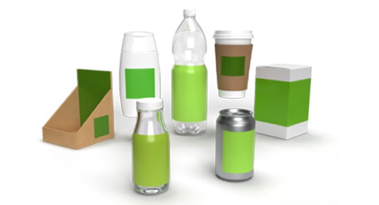
Innovative packaging can help products stand out on the shelf. However, matching brand color across different pack types like stand-up pouches, folding cartons, labels, overwraps, and shelf trays can be challenging. When printing, brands can use either a spot color or a CMYK breakdown. While spot colors are more accurate, CMYK is more economical. For both, the choice of packaging material, printing process, and ink can significantly influence the final appearance of a brand's color on the shelf.
"Color consistency is critical in brand recognition because consumers often associate any color discrepancy with product quality," says Cindy Cooperman, vice president, brand global strategic accounts, X-Rite Pantone. "Our Brand Color Assessment Profile aims to alleviate this by helping brands understand how color will reproduce early in the design process before color samples are even sent."
With this program, X-Rite Pantone’s Color Experts will create a personalized Color Assessment Profile using the brand’s specified color. Brand managers and designers can use this report to:
For a limited time, X-Rite Pantone is offering the Brand Color Assessment Profile for no charge. To learn more, visit https://www.xrite.com/categories/training/cpg-brand-color-assessment-program
Innovative packaging can help products stand out on the shelf. However, matching brand color across different pack types like stand-up pouches, folding cartons, labels, overwraps, and shelf trays can be challenging. When printing, brands can use either a spot color or a CMYK breakdown. While spot colors are more accurate, CMYK is more economical. For both, the choice of packaging material, printing process, and ink can significantly influence the final appearance of a brand's color on the shelf.
"Color consistency is critical in brand recognition because consumers often associate any color discrepancy with product quality," says Cindy Cooperman, vice president, brand global strategic accounts, X-Rite Pantone. "Our Brand Color Assessment Profile aims to alleviate this by helping brands understand how color will reproduce early in the design process before color samples are even sent."
With this program, X-Rite Pantone’s Color Experts will create a personalized Color Assessment Profile using the brand’s specified color. Brand managers and designers can use this report to:
- See how specific brand colors will look on multiple packaging substrates.
- Determine whether CMYK is accurate enough for various pack types.
- Make informed color decisions early in the design phase.
- Save time, minimize unexpected surprises, and eliminate time wasted trying to hit unachievable colors
For a limited time, X-Rite Pantone is offering the Brand Color Assessment Profile for no charge. To learn more, visit https://www.xrite.com/categories/training/cpg-brand-color-assessment-program
