11.20.15
Black River Juice is the ultimate “back to the earth” organic beverage company. The business was founded more than 30 years ago in Mississauga, Canada, by two enterprising truck drivers who saw an opportunity in pressing and marketing specialty fruit juices. Though the company has grown to comprise 37 products, Black River Juice still maintains its focus on creating exceptional juices and juice blends that are 100% pure, without any added sugar or preservatives. “We use the finest ingredients in the world, and we source locally as much as we can. We have relationships with farmers that date back to when we were first founded,” says, Jessica Praskey, sales and marketing manager, Black River Juice.
While the company has been successful in Ontario, Praskey wanted to expand its reach within its native Canada and enter the US and Asian markets. However, the juice industry is fiercely competitive. With myriad options available, high-end retailers can be discerning about the products they stock. And in grocery and specialty stores, products compete for brand-conscious and price-sensitive consumers’ attention on crowded retail shelves. To spur significant sales growth and influence point-of-sales decision-making, Praskey knew she needed a new packaging strategy.
“Our packaging did not convey the value of what was in our bottles,” she explains. The company used glue-applied paper labels, which hid products from consumers’ gaze and had a dated look. To support premium pricing, Black River Juice needed a new high-end appearance.
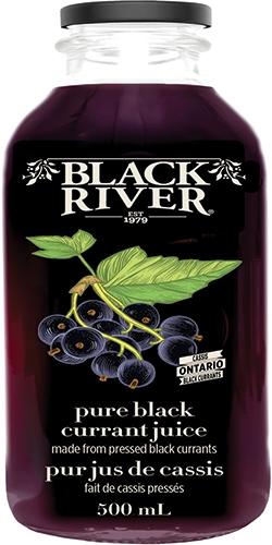
A mockup of the new packaging
A new labeling strategy
Praskey set out to find a new label that would enhance branding and product presentation. She decided to visit Pack Expo in Chicago in November 2014 to scout new options. “I had walked by rows upon rows of label suppliers, when I saw a bottle with Vanish sitting on the shelf at the UPM Raflatac booth. It really caught my eye and made me stop and look and start thinking about how it would look on our products,” says Praskey.
She decided to use Vanish’s clear canvas to design a new brand that she describes as “classic, but really warm and conveyed the premium value of our products. We’ve created a unique look for our Black River juices by using illustrations rather than pictures. We worked with an artist to conceive old woodcut-style fruit drawings that look like screen prints. They look incredible on the Vanish substrate. With some of our products, we had the challenge of showing dark fruit images on a dark juice. So we printed a white layer underneath only the fruit woodcuts and lettering, and the image just pops right off the bottle. The label just disappears,” says Praskey.
Supporting sustainability
Sustainability was also a big concern. “It’s nice to know that our environmental impact will be lower with ultra-thin PET labels than paper labels,” says Praskey. Not only are Vanish labels recyclable, but they use less material and energy and produce less waste. “That’s a great story for us, and we’ll be sharing how we have built our packaging to be environmentally responsible,” she says.
Praskey worked with Glenn Shaw, general manager/business development, Forte Labels and Shrink Sleeves to implement the new labeling strategy, moving from glue-applied paper labels to Vanish .92 mil PET PS labels. “Clear-on-clear labels are more efficient, cleaner and environmentally better than glue-applied labels,” says Shaw. “You can get more labels on a roll with clear-on-clear than clear-on-white or paper, and you can run more bottles per minute than cut-and-stack. There’s less downtime, and the product is much better.”
Praskey values the operational flexibility Vanish enables. “Currently, we are a smaller company, but we have 37 SKUs. So it’s been great to print 50,000 or 100,000 of each label, although that will certainly grow. We would not have been able to use Vanish if the minimum runs were too big for us. We haven’t launched the new packaging yet, but we’re getting tremendous response from anyone we show the bottles to, from retailers to distributors and consumers across the country,” says Praskey, adding she has already recommended Vanish to a specialty tea manufacturer and an olive oil company that are rebranding products with clear labels. “We have a special offering, and with our packaging we’re absolutely set apart from our competition now. There’s no question that Black River Juice will be a primary focus on the shelf as soon as the bottle is launched. The whole process has been amazing.”
While the company has been successful in Ontario, Praskey wanted to expand its reach within its native Canada and enter the US and Asian markets. However, the juice industry is fiercely competitive. With myriad options available, high-end retailers can be discerning about the products they stock. And in grocery and specialty stores, products compete for brand-conscious and price-sensitive consumers’ attention on crowded retail shelves. To spur significant sales growth and influence point-of-sales decision-making, Praskey knew she needed a new packaging strategy.
“Our packaging did not convey the value of what was in our bottles,” she explains. The company used glue-applied paper labels, which hid products from consumers’ gaze and had a dated look. To support premium pricing, Black River Juice needed a new high-end appearance.
A mockup of the new packaging
A new labeling strategy
Praskey set out to find a new label that would enhance branding and product presentation. She decided to visit Pack Expo in Chicago in November 2014 to scout new options. “I had walked by rows upon rows of label suppliers, when I saw a bottle with Vanish sitting on the shelf at the UPM Raflatac booth. It really caught my eye and made me stop and look and start thinking about how it would look on our products,” says Praskey.
She decided to use Vanish’s clear canvas to design a new brand that she describes as “classic, but really warm and conveyed the premium value of our products. We’ve created a unique look for our Black River juices by using illustrations rather than pictures. We worked with an artist to conceive old woodcut-style fruit drawings that look like screen prints. They look incredible on the Vanish substrate. With some of our products, we had the challenge of showing dark fruit images on a dark juice. So we printed a white layer underneath only the fruit woodcuts and lettering, and the image just pops right off the bottle. The label just disappears,” says Praskey.
Supporting sustainability
Sustainability was also a big concern. “It’s nice to know that our environmental impact will be lower with ultra-thin PET labels than paper labels,” says Praskey. Not only are Vanish labels recyclable, but they use less material and energy and produce less waste. “That’s a great story for us, and we’ll be sharing how we have built our packaging to be environmentally responsible,” she says.
Praskey worked with Glenn Shaw, general manager/business development, Forte Labels and Shrink Sleeves to implement the new labeling strategy, moving from glue-applied paper labels to Vanish .92 mil PET PS labels. “Clear-on-clear labels are more efficient, cleaner and environmentally better than glue-applied labels,” says Shaw. “You can get more labels on a roll with clear-on-clear than clear-on-white or paper, and you can run more bottles per minute than cut-and-stack. There’s less downtime, and the product is much better.”
Praskey values the operational flexibility Vanish enables. “Currently, we are a smaller company, but we have 37 SKUs. So it’s been great to print 50,000 or 100,000 of each label, although that will certainly grow. We would not have been able to use Vanish if the minimum runs were too big for us. We haven’t launched the new packaging yet, but we’re getting tremendous response from anyone we show the bottles to, from retailers to distributors and consumers across the country,” says Praskey, adding she has already recommended Vanish to a specialty tea manufacturer and an olive oil company that are rebranding products with clear labels. “We have a special offering, and with our packaging we’re absolutely set apart from our competition now. There’s no question that Black River Juice will be a primary focus on the shelf as soon as the bottle is launched. The whole process has been amazing.”
