Steve Katz, Editor04.14.14
In the US, bottled water is the second largest commercial beverage category by volume – slightly ahead of milk and beer (though about half the volume of soda). According to market research firm Euromonitor Internoational, total volumes are expected to eclipse 300 billion liters in 2014, making bottled water pass tea as the world’s most consumed packaged beverage this year. The market is highly competive, so labels and packaging play a pivotal role in driving consumers toward a purchase.
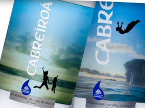
The Cabreiroá logo on the front label had to be a strong, clean white to stand out against the photographic back label image.
In Western Europe, natural mineral and spring-bottled waters dominate the market, which is attributable to consumer appreciation for water sourced from natural springs and wells. Throughout Europe, there a several regional brands that competer for consumer's attention among the national and international names. One such brand is Cabreiroá, a mineral water derived from springs in the Galicia region of Spain. A leading brand in this region for more than 100 years, Cabreiroá’s owner Hijos de Rivera is now setting its sights on increasing its national presence.
In order to meet its goals, Cabreiroá has turned to its label and packaging as a means to differentiate itself from the competition. The brand is being revitalized with a new PET bottle range and a collection of six pressure sensitive labels, printed by beverage label specialist Spear.
“Since 1906 we’ve worked for our products to become recognized in the natural mineral water world. Cabreiroá’s new PET containers, characterized by a clean modern line, are a consequence of this constant effort,” says Juan Paz García, of Hijos de Rivera.
Aimed at the premium market, Cabreiroá’s rebranding campaign is designed to represent vitality together with its Galician origin. Each of the six back labels are printed with a different, mirrored scenery. Spear then applied a solid white to conceal the graphics, before printing the back label design, which proudly promotes Cabreiroá’s sponsorship of the Spanish national soccer team.
The project presented a unique challenge. The Cabreiroá logo on the front label had to be a strong, clean white to stand out against the photographic back label image. In line with requirements for a premium-look package, Spear chose a highly reflective silver, printed sub-surface, to create a foil effect on which to display the beverage description. The result is an aquatic scene magnified through the bottle, complimenting the energetic silhouette on the front label.
“The new labels represent a turning point into the world of PET containers. Thanks to our collaboration with Spear, we have achieved optimal synchrony between the front and back label. In our opinion, this is a fantastic method of conveying a message of vitality and Galician origin in a simple and natural way,” Paz García says.
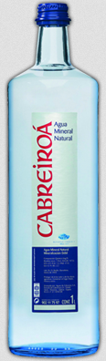
Cabreiroá's old look
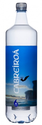
Cabreiroá's revitalized label, printed by Spear.
The Cabreiroá logo on the front label had to be a strong, clean white to stand out against the photographic back label image.
In order to meet its goals, Cabreiroá has turned to its label and packaging as a means to differentiate itself from the competition. The brand is being revitalized with a new PET bottle range and a collection of six pressure sensitive labels, printed by beverage label specialist Spear.
“Since 1906 we’ve worked for our products to become recognized in the natural mineral water world. Cabreiroá’s new PET containers, characterized by a clean modern line, are a consequence of this constant effort,” says Juan Paz García, of Hijos de Rivera.
Aimed at the premium market, Cabreiroá’s rebranding campaign is designed to represent vitality together with its Galician origin. Each of the six back labels are printed with a different, mirrored scenery. Spear then applied a solid white to conceal the graphics, before printing the back label design, which proudly promotes Cabreiroá’s sponsorship of the Spanish national soccer team.
The project presented a unique challenge. The Cabreiroá logo on the front label had to be a strong, clean white to stand out against the photographic back label image. In line with requirements for a premium-look package, Spear chose a highly reflective silver, printed sub-surface, to create a foil effect on which to display the beverage description. The result is an aquatic scene magnified through the bottle, complimenting the energetic silhouette on the front label.
“The new labels represent a turning point into the world of PET containers. Thanks to our collaboration with Spear, we have achieved optimal synchrony between the front and back label. In our opinion, this is a fantastic method of conveying a message of vitality and Galician origin in a simple and natural way,” Paz García says.
Cabreiroá's old look
Cabreiroá's revitalized label, printed by Spear.
