Catherine Diamond, Associate Editor07.21.14
Labels are a product’s introduction to the world. They convey messages, set a tone, and implore consumers to imagine themselves engaging with that product. In order to capture a consumer’s attention, a label’s design must be deliberate and meaningful.

Onyx Moonshine’s original label
Adam von Gootkin, co-founder of East Hartford, CT, USA-based Onyx Spirits Company, knows this all too well. Since opening its doors less than three years ago, Onyx Spirits has enjoyed significant success. Its original product, Onyx Moonshine, was launched in 2011. It was the first legal moonshine in New England since prohibition, and the first “ultra-premium” American moonshine ever, the company says. Today, Onyx has released half a dozen products, each of which has had its own unique identity – and unique labels – while also managing to stay “on brand.”
Von Gootkin says that expanding the Onyx brand with individual products has been the biggest challenge and the most fun part of the process.
“Because we’re producing a moonshine, our customers are both vodka drinkers and whiskey drinkers,” he says. “It also means our competition is both vodka and whiskey. From a design standpoint, we needed to stay on brand in order to do what we envisioned for the company.”
After launching Onyx Moonshine, von Gootkin says many of his customers expressed a desire for a higher proof. “So, we came out with Onyx 111, which is a red label, as opposed to the original black. We wanted to keep it high end, keep it quality, and keep the same quality paper,” he says. “We wanted it to look like Onyx, but different. We thought that the bright red would express that this one is a little hotter, a little richer.”
Next, the company launched its Harvest Infusion line. Every season, when new produce is available in New England, von Gootkin says his company wants to partner with local farmers and produce a limited-edition, flavored moonshine.
“Apple Honey was the first one,” he says. “Connecticut has great apples in the fall, great orchards, so it was a natural choice for us. We designed that label, and while we wanted to stay on brand, we also wanted it to have a little more of an organic or farm feel without making it hokey or too cheesy or going overboard with the kitschy farm thing.
“It’s the same shape as the regular Onyx label, same diecut, but has a background of paper instead of the fancier swirls you see on our original label. We made it look almost like a canvas or burlap sack. We wanted it to have the ‘farm’ look but still be ultra-premium,” he says.

The Cape Cod Cranberry label has a nautical theme.
Any brand owner knows the struggles of introducing a new product to the world. You wonder: Have we hit the right mark? Will people respond to this? According to von Gootkin, Onyx’s Apple Honey moonshine was a success.
“It went really well,” he says. “We completely sold out within a couple weeks. That came out in the fall and we’ll definitely do it again. It was a huge success.”
Last year, von Gootkin says his company started aging moonshine and its first release of Secret Stash Private Barrel Moonshine was last year. It was the company’s most expensive product to date at $70 per bottle.
“The whiskey came out superb, and we actually just won an award for it,” von Gootkin says.
Onyx only released 33 barrels of Secret Stash, and each was individually bottled. Because of the nature of barrel aging, each one tastes just a bit different, he says.
“That came out in December and sold out in 48 hours,” he says.
Nearly 1100 bottles were presold to stores. For that label, von Gootkin says it was the first time the company had gone away from the diecut found on its original Onyx product. “For that product, we decided to keep it very, very minimal, so that one is just a square,” he says. “We really wanted to hammer the point home that this was simply Onyx put in a barrel to age.”
Because von Gootkin says this was a historical release for Connecticut, he and his partner decided to handwrite the barrel number and bottle number on each label. “It’s about as craft and small as you can get,” he says. “Most whiskeys are all being blended together in massive, thousand gallon tanks. Its extreme handcrafted. We really wanted that personal touch, and we didn’t want Secret Stash to be as polished as our other products. We wanted to give the impression or the image of someone who might have been renovating their house and found this bottle hidden in the wall.”
The label required a UPC code and the standard government warning found on alcohol, but von Gootkin says that’s it. There is no marketing or anything else – just the simple label in front.
“We wanted to let it speak for itself,” he says. “It’s such a high quality whiskey and we really wanted it to be minimal for that price point.”
This spring, Onyx partnered with a local bog and released Cape Cod Cranberry Moonshine. “We worked with PJ’s Cranberries in East Sandwich, MA. He grows incredibly fresh cranberries and he’s commonwealth-certified, which means he emphasizes sustainability, harvests them very delicately by hand – its really old school,” von Gootkin says. “We felt that cranberry was a great flavor; it has that New England spirit.”
Von Gootkin says that it took the company about six months to finalize the design for that label, and they looked no further than Cape Cod for the inspiration behind it.
“It was inspired by the colors of Cape Cod potato chips,” he says. “Its kind of nautical, white and navy blue. It’s still an ultrapremium moonshine, so we incorporated gold foil into it, too. We also wanted to work with white and it ‘popped’ really well with the color of the contents. The white with dark blue and hints of gold really pop against the red that’s inside the bottle.”
To keep with the nautical theme, von Gootkin says he had the designers use in the background of the bottle a scan of a printed image of a Cape Cod nautical map.
“Overall, it came out really beautiful,” he says.
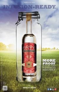
The Onyx 111 label uses red instead of the black color in the original label.
Design meets construction
In order for a label’s design to be successful, its construction has to be aligned to the product’s function. For example, a bottle of Onyx Moonshine has to be able to withstand wet conditions. Otherwise, the beautiful label that took so much time to design would simply peel away. You could say that designers bring a brand owners’ image to life, while those responsible for the construction of a label ensure that that image is consistent and reliable.
FLEXcon is a manufacturer of pressure sensitive films and adhesives based in Spencer, MA, USA. Though the company has no direct involvement in the graphics of a label, Product Manager Ron Ducharme says the company prides itself on “playing a deeper role by working with customers and end users to ensure that their labels will perform for the life cycle of the product to which it will be applied.”
According to Ducharme, FLEXcon opens a dialog about the label’s construction by asking a series of questions about its application. For instance: To what surface will it be applied, and to what environmental conditions will it be exposed? What is the life expectancy of the end-use product? And, finally, are there any regulatory requirements that need to be met, such as UL, REACH or RoHS?
Brian Ayers, product manager, elaborates: “If we are dealing with an in-mold application as opposed to pressure-sensitive, we will also ask what type of plastic is being injected into the mold in order to ensure compatibility.
“Once these questions are answered, we strive to fine-tune the information,” Ayers says. “For example, if we are told that the label will be applied to plastic, we will ask ‘what kind of plastic,’ etc., with the goal of acquiring as much detail about the application as possible. There are numerous types of surface materials – from smooth to textured, and from nonporous metals to low-surface energy plastics – to which durable-goods nameplates and labels must adhere. In order to provide the best polymeric facestock material and adhesive to enable the label to perform as designed, very specific information is required. “Consequently, if the answers to the above questions do not conclusively indicate a specific product, the FLEXcon representative will most likely offer to perform testing to determine what construction will best suit the application. We will do cycle testing for exterior durability, peels and shear adhesion to determine the best adhesive to bond to the surface, and humidity chamber testing to learn the long term affects of climate (humid or arid). This is all done with an eye toward finding the most appropriate product to meet the customer’s requirements, whether it be an agency specification or an end user specification.”
Planning a label’s construction is an important process, and one that FLEXcon says it does not take lightly. Most often, FLEXcon’s contact is with the label converter, rather than the end user. According to Ducharme, the label converter is often being counted on to select an appropriate label substrate for the application. Challenges often include acquiring adequate information about end use applications.
“This is our greatest challenge,” Ducharme says. “This usually necessitates testing on behalf of the converter to ensure selection of the proper construction. Changes in the specifications once testing has started can pose a significant challenge as well, because a simple change in surface texture, color or size can make a major difference in the way a label performs. On the occasions where FLEXcon is able to work in collaboration with the converter and the end user, there is a better transfer of information, which enables us to achieve the best possible result.”
In addition to its work in graphics and label applications, FLEXcon’s expertise is in bonding, barrier, optical and electronics applications. When designing label constructions for durables, FLEXcon says its laboratories are able to assist with label design from a performance standpoint, including performance mandated by UL or other regulatory agencies.
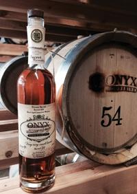
The Secret Stash label evokes barrel-aging.
“End users provide us with specifications as to regulatory compliance, performance and durability – agency recognition, heat resistance, UV or chemical exposure, for example – and we are able to recommend or develop a product that is sure to meet their specific needs,” Ayers says.
“End users that have taken the step to involve the film supplier during the design stage of their product have found that this collaboration yields positive results that can impact product factors such as functionality, styling and cost, among others. The collaboration also allows FLEXcon to be able to make recommendations regarding special effects that a design engineer might want to incorporate – like tamper-resistant security features or a brushed metal look to reduce the cost and weight associated with real metal nameplates.”
Ayers adds, “By having the end user’s perspective on nameplate and label placement, size, shape and regulatory guidelines, FLEXcon is able to hone in on specific required functionality, and by working with a supplier that specializes in UL, cUL and CSA-recognized materials as well as a converter well-versed in utilizing these components, end users avoid the hassle of extensive testing required for label certification, a process that can increase costs, take several months, and hinder time to market.”
Onyx Moonshine’s original label
Adam von Gootkin, co-founder of East Hartford, CT, USA-based Onyx Spirits Company, knows this all too well. Since opening its doors less than three years ago, Onyx Spirits has enjoyed significant success. Its original product, Onyx Moonshine, was launched in 2011. It was the first legal moonshine in New England since prohibition, and the first “ultra-premium” American moonshine ever, the company says. Today, Onyx has released half a dozen products, each of which has had its own unique identity – and unique labels – while also managing to stay “on brand.”
Von Gootkin says that expanding the Onyx brand with individual products has been the biggest challenge and the most fun part of the process.
“Because we’re producing a moonshine, our customers are both vodka drinkers and whiskey drinkers,” he says. “It also means our competition is both vodka and whiskey. From a design standpoint, we needed to stay on brand in order to do what we envisioned for the company.”
After launching Onyx Moonshine, von Gootkin says many of his customers expressed a desire for a higher proof. “So, we came out with Onyx 111, which is a red label, as opposed to the original black. We wanted to keep it high end, keep it quality, and keep the same quality paper,” he says. “We wanted it to look like Onyx, but different. We thought that the bright red would express that this one is a little hotter, a little richer.”
Next, the company launched its Harvest Infusion line. Every season, when new produce is available in New England, von Gootkin says his company wants to partner with local farmers and produce a limited-edition, flavored moonshine.
“Apple Honey was the first one,” he says. “Connecticut has great apples in the fall, great orchards, so it was a natural choice for us. We designed that label, and while we wanted to stay on brand, we also wanted it to have a little more of an organic or farm feel without making it hokey or too cheesy or going overboard with the kitschy farm thing.
“It’s the same shape as the regular Onyx label, same diecut, but has a background of paper instead of the fancier swirls you see on our original label. We made it look almost like a canvas or burlap sack. We wanted it to have the ‘farm’ look but still be ultra-premium,” he says.
The Cape Cod Cranberry label has a nautical theme.
Any brand owner knows the struggles of introducing a new product to the world. You wonder: Have we hit the right mark? Will people respond to this? According to von Gootkin, Onyx’s Apple Honey moonshine was a success.
“It went really well,” he says. “We completely sold out within a couple weeks. That came out in the fall and we’ll definitely do it again. It was a huge success.”
Last year, von Gootkin says his company started aging moonshine and its first release of Secret Stash Private Barrel Moonshine was last year. It was the company’s most expensive product to date at $70 per bottle.
“The whiskey came out superb, and we actually just won an award for it,” von Gootkin says.
Onyx only released 33 barrels of Secret Stash, and each was individually bottled. Because of the nature of barrel aging, each one tastes just a bit different, he says.
“That came out in December and sold out in 48 hours,” he says.
Nearly 1100 bottles were presold to stores. For that label, von Gootkin says it was the first time the company had gone away from the diecut found on its original Onyx product. “For that product, we decided to keep it very, very minimal, so that one is just a square,” he says. “We really wanted to hammer the point home that this was simply Onyx put in a barrel to age.”
Because von Gootkin says this was a historical release for Connecticut, he and his partner decided to handwrite the barrel number and bottle number on each label. “It’s about as craft and small as you can get,” he says. “Most whiskeys are all being blended together in massive, thousand gallon tanks. Its extreme handcrafted. We really wanted that personal touch, and we didn’t want Secret Stash to be as polished as our other products. We wanted to give the impression or the image of someone who might have been renovating their house and found this bottle hidden in the wall.”
The label required a UPC code and the standard government warning found on alcohol, but von Gootkin says that’s it. There is no marketing or anything else – just the simple label in front.
“We wanted to let it speak for itself,” he says. “It’s such a high quality whiskey and we really wanted it to be minimal for that price point.”
This spring, Onyx partnered with a local bog and released Cape Cod Cranberry Moonshine. “We worked with PJ’s Cranberries in East Sandwich, MA. He grows incredibly fresh cranberries and he’s commonwealth-certified, which means he emphasizes sustainability, harvests them very delicately by hand – its really old school,” von Gootkin says. “We felt that cranberry was a great flavor; it has that New England spirit.”
Von Gootkin says that it took the company about six months to finalize the design for that label, and they looked no further than Cape Cod for the inspiration behind it.
“It was inspired by the colors of Cape Cod potato chips,” he says. “Its kind of nautical, white and navy blue. It’s still an ultrapremium moonshine, so we incorporated gold foil into it, too. We also wanted to work with white and it ‘popped’ really well with the color of the contents. The white with dark blue and hints of gold really pop against the red that’s inside the bottle.”
To keep with the nautical theme, von Gootkin says he had the designers use in the background of the bottle a scan of a printed image of a Cape Cod nautical map.
“Overall, it came out really beautiful,” he says.
The Onyx 111 label uses red instead of the black color in the original label.
Design meets construction
In order for a label’s design to be successful, its construction has to be aligned to the product’s function. For example, a bottle of Onyx Moonshine has to be able to withstand wet conditions. Otherwise, the beautiful label that took so much time to design would simply peel away. You could say that designers bring a brand owners’ image to life, while those responsible for the construction of a label ensure that that image is consistent and reliable.
FLEXcon is a manufacturer of pressure sensitive films and adhesives based in Spencer, MA, USA. Though the company has no direct involvement in the graphics of a label, Product Manager Ron Ducharme says the company prides itself on “playing a deeper role by working with customers and end users to ensure that their labels will perform for the life cycle of the product to which it will be applied.”
According to Ducharme, FLEXcon opens a dialog about the label’s construction by asking a series of questions about its application. For instance: To what surface will it be applied, and to what environmental conditions will it be exposed? What is the life expectancy of the end-use product? And, finally, are there any regulatory requirements that need to be met, such as UL, REACH or RoHS?
Brian Ayers, product manager, elaborates: “If we are dealing with an in-mold application as opposed to pressure-sensitive, we will also ask what type of plastic is being injected into the mold in order to ensure compatibility.
“Once these questions are answered, we strive to fine-tune the information,” Ayers says. “For example, if we are told that the label will be applied to plastic, we will ask ‘what kind of plastic,’ etc., with the goal of acquiring as much detail about the application as possible. There are numerous types of surface materials – from smooth to textured, and from nonporous metals to low-surface energy plastics – to which durable-goods nameplates and labels must adhere. In order to provide the best polymeric facestock material and adhesive to enable the label to perform as designed, very specific information is required. “Consequently, if the answers to the above questions do not conclusively indicate a specific product, the FLEXcon representative will most likely offer to perform testing to determine what construction will best suit the application. We will do cycle testing for exterior durability, peels and shear adhesion to determine the best adhesive to bond to the surface, and humidity chamber testing to learn the long term affects of climate (humid or arid). This is all done with an eye toward finding the most appropriate product to meet the customer’s requirements, whether it be an agency specification or an end user specification.”
Planning a label’s construction is an important process, and one that FLEXcon says it does not take lightly. Most often, FLEXcon’s contact is with the label converter, rather than the end user. According to Ducharme, the label converter is often being counted on to select an appropriate label substrate for the application. Challenges often include acquiring adequate information about end use applications.
“This is our greatest challenge,” Ducharme says. “This usually necessitates testing on behalf of the converter to ensure selection of the proper construction. Changes in the specifications once testing has started can pose a significant challenge as well, because a simple change in surface texture, color or size can make a major difference in the way a label performs. On the occasions where FLEXcon is able to work in collaboration with the converter and the end user, there is a better transfer of information, which enables us to achieve the best possible result.”
In addition to its work in graphics and label applications, FLEXcon’s expertise is in bonding, barrier, optical and electronics applications. When designing label constructions for durables, FLEXcon says its laboratories are able to assist with label design from a performance standpoint, including performance mandated by UL or other regulatory agencies.
The Secret Stash label evokes barrel-aging.
“End users provide us with specifications as to regulatory compliance, performance and durability – agency recognition, heat resistance, UV or chemical exposure, for example – and we are able to recommend or develop a product that is sure to meet their specific needs,” Ayers says.
“End users that have taken the step to involve the film supplier during the design stage of their product have found that this collaboration yields positive results that can impact product factors such as functionality, styling and cost, among others. The collaboration also allows FLEXcon to be able to make recommendations regarding special effects that a design engineer might want to incorporate – like tamper-resistant security features or a brushed metal look to reduce the cost and weight associated with real metal nameplates.”
Ayers adds, “By having the end user’s perspective on nameplate and label placement, size, shape and regulatory guidelines, FLEXcon is able to hone in on specific required functionality, and by working with a supplier that specializes in UL, cUL and CSA-recognized materials as well as a converter well-versed in utilizing these components, end users avoid the hassle of extensive testing required for label certification, a process that can increase costs, take several months, and hinder time to market.”
