Shawn Oetjen03.09.15
In today’s packaging market, brand identity is crucial. Color plays a vital part in brand identity and customers are requiring more accurate color reproduction every day. Lab* color space plays an essential role in the entire color process from color managing files to reading Delta E’s. A basic knowledge of the Lab* color space is useful in understanding the final color outcome. Before covering the specifics of Lab* color space, I’d like to discuss some general color principles to provide an overarching understanding of the color space itself.

Shawn Oetjen
Two colors that appear the same will have the same Lab* values yet they may not have the same CMYK or RGB recipe. Variables such as lighting conditions and optical brighteners can skew the perceived color results, however, these are beyond the scope of this article. I have significantly simplified some of the factors and terminology for ease of understanding to illustrate the basic principles and phenomenal power of the Lab* color space. Without discussing the complex intricacies involved with it, thereby allowing all readers a basic understanding of Lab*. For those color geeks out there who may be offended by the liberties I am taking, please accept my sincerest apologies.
Lab* is an independent color space which makes it a powerful tool. It is the hub for color management color conversions. Lab* assigns numerical values to color allowing us to quantify color data, thus making it unambiguous. So WTH (What The Heck) is an independent color space and why is it so special? To attain a better understating of an independent color space, let’s first talk about its opposite, the dependent color space. CMYK is a great example of a dependent color space. In the simplest terms the color output of a dependant color space is dependent on many variables in the print process. If you printed 25% cyan 50% magenta 0 yellow and 0 black on three different types of presses at three different locations, would the colors look the same? No, they would not because they are dependent on the equipment, along with other variables that go into the process. Look at the three samples on the next page. The colors look different even though the same amounts of CMYK inks were printed. If you measured them with a spectrophotometer they would all have different Lab* values (because they are different colors) even though they were made from the same CMYK make up.
The Lab* color space allows you to quantify the color utilizing an independent color space. This means that the values give you an independent value representing that color. In the simplest terms, if you have the same Lab* values you will have the same color, different lab* values a different color. If you look at the three samples they all have the same Lab* values. However, to compensate for the inherent variation in the printing process (dependent color space), the CMYK values for each printer has been adjusted specifically for that process. The result is the same color appearance on the final press sheet. In short, different CMYK percentages have to be printed depending on the print variable to achieve the same color output.
This Lab* data, combined with some pretty sweet math equations and computing power, will allow you to manage the millions of different color combinations in process printing throughout the workflow with the click of a button. It will calculate the percentages of CMYK ink needed for each color based on the print sample profile and should bring the colors closer to the intended results. Without the independent color space, i.e. Lab*, it would be more difficult to accomplish this task.
You can’t look at or measure a random color and decipher the exact percentages of CMYK that were used to create it because the final print results are dependent on the many variables that go into the printing process (e.g., ink, plates, substrate, operator). However, the Lab* data is independent and gives you, for lack of better words, the raw color data.
The Lab* color space is based on the three attributes of color: hue, saturation and lightness. Hue is the color itself and will change as you go around the Lab* diagram. Saturation is how bright or vivid a color is versus how dull or gray a color is. As you move away from the center of the color wheel, the colors increase in saturation. Lightness is how light or dark a color is.
The Lab* data is collected when a spectrophotometer shines a light on the sample and then analyzes the wave lengths of light that are reflected back to the instrument. Filters or a prismatic grid assist in the data collection. The data is then mapped to three numerical values that correspond to an L, a and b axis. The three axes create a three dimensional color space; think of it as a sphere.
The a* and b* axes work together to create a Cartesian plane and define the hue and saturation of a color. The a* axis is defined as the red green axis. Working from the middle of the axis to the “a+” (A plus) or red side, the numerical values for the corresponding colors increase. From the middle of the same axis to the opposite side, the “a-” (A minus) or green side, the numbers decrease and are thus negative. “a-” is green because the opposite of red on the color wheel is green. Note that the foremost point on the “a+” side is not a fire engine red; it is similar to magenta. I would like to mention that with standard printing conventions it is virtually impossible to get a color at the edge of any of these axes. It can be confusing to keep the orientations straight. One way how I remember “a+” is red: When you receive an A+ on your papers, it is marked in red ink.
The b* axis is similar to the a* axis but for blue and yellow. Working from the middle of the axis to the “b+” or yellow side, the numerical values for the corresponding colors get larger. From the middle of the same axis to the opposite side known as the b- or blue side, the numbers decrease becoming negative.
The a* and b* axes are perpendicular to each other and allow you to identify the hue and saturation of the color. Let’s take a “hands on” look with a few examples. For now we are only going to look at the a* and b* coordinates of a color. We will discuss the L value later.
What is the approximate color with an a* value of -80 and b* values of -40? Use the image above to “plot the color”. The color is going to be a bluish green. The beauty of the Lab* or any independent color system is that you can accurately communicate the color you want by utilizing the coordinate values for that specific color. It eliminates color commentary like, “Can you blue that color up?” or “I was imagining a dirtier color.” Comments like those can mean vastly different things to each person and ultimately result in colors that are not close to customer expectations. This is why numerical expression is so important, to get agreement on the given color.
With that said, it does not mean that I will call this color “a*-80 b*-40.” Instead, this numerical digital color target, similar to a color standard in a digital form, can be easily shared all over the world, resulting in consistent expectations and color matches. Colors that have the same Lab* values should look the same. However, variables like optical brighteners, lighting conditions, and metamerism can lead to different appearances.
 Below are a few other colors to plot ensuring you have a good understanding of how the ab*axes work together before we move forward. Take a second to “plot” the colors. Write in the approximate color name next to the Lab* values. The answers can be found at the end of the article. Keep in mind, this is just an exercise to build confidence in your understanding of the ab* axes. An exact color match is not crucial, however if the result should be a red and you put blue, you may want to review the first part of the article.
1. a +127 b 0 Approximate color: ___magenta_____
2. a +100 b +100 Approximate color: ___red_____
3. a +127 b -127 Approximate color: ___purple_____
4. a -80 b +76 Approximate color: ___green_____
In flexographic printing, the anilox roll is a crucial part in achieving Lab* values. The volume of the anilox roll is of the utmost importance because it directly effects the amount of ink that is carried to the plate. The anilox cell opening, in relationship to the depth of the engraving, will influence the ink release properties from that specific roll, effecting your ink film thickness (color) of the final print. If you have two anilox rolls with the same volume but different cells per inch engravings, the anilox roll with the lower cells per inch (bigger cell openings) will have an increased ink release characteristic thus resulting in a thicker ink film deposited on the substrate and a more saturated color. The thicker ink film will alter the ab* values. Many inks will hook to the right or left on the ab* axes as you increase the ink film thickness.
Now that you understand the ab* axes, let’s discuss the vital importance of the L axis. The L axis is perpendicular to the ab* axes and identifies the brightness or lightness of the color. I have heard both brightness and lightness used interchangeably to describe the axis. The numerical values for the L axis go from 0 to 100, where 0 is “dark” and 100 is “light.” I remember this by thinking about a light bulb; a 100 watt bulb is bright while a 0 watt bulb produces no light and is thus dark.
Let’s take a look at a few examples to get an idea of how this works. A color with the following values, a* = 0 b* = 0 L = 0 is in the center of the axes making it hue-less or gray. The L value of 0 tells us that, in this instance, it is on the dark side of the axis resulting in a dark gray, similar to a black. If we take another color with the following values, a* = 0 b* = 0 L = 50, it will again be a gray but because the L value is at 50 it is a medium gray. If the L value were at 100 it would be a light gray, almost white.

It is a common misconception in flexographic printing that increasing the volume of an anilox roll will merely alter the L* value. This however is not true. Yes, increased anilox roll volume will deliver more ink to the substrate thus creating a “darker” color and a lower L value. It will also influence the color itself because more pigment is delivered thus altering the ab* values as well.
Now that we understand the basic principles of the L a b* axis let’s throw some color into the mix. We have a color with a* = -100, b* = -100, and L = 90 values. Based on the Lab* coordinates, it is a light blue. If we change the L value from 90 to 10 the hue stays the same, it simply appears to be a darker blue.
Let’s put it all together and test your knowledge with a short quiz. First answer the questions below. Then match the Lab* values with the correct color block by placing the letter of the corresponding color block in the blank next to the Lab* values. Use the ab* coordinate color wheel from earlier to identify the hue and saturation of the color and then look at the L value to identify the brightness of the color.
What is an independent color space?
 What is a dependent color Space?
What color is associated with the A+ side of the axis?
What color is associated with the B- side of the axis?
What are the numerical values accosted with the L axis and what do they signify?
I hope you have a better understating of Lab* color space and see why it is a powerful tool for not only color management but also color communication. Please remember Lab* was discussed in a simplistic approach in this article to increase understanding. Without Lab* accurately communicating color, it would be next to impossible. How would you communicate that you want a color just a little bluer to someone standing right next to you? Now imagine trying to accomplish that monumental task with someone halfway around the globe – good luck. Lab* is an integral portion along almost every vital crossroads throughout the printing workflow. When you are contemplating an anilox roll change to match a color think about its impact on all aspects of the color. And next time you are in the grocery store, think about the impact that Lab* had on your shopping decisions.
Answers:
1. Magenta 2. Red 3. Purple 4.Green
1.G 2.D 3.H 4.C 5.F 6.E 7.A 8.B
About the Author
Shawn Oetjen, Midwest Technical Graphics Advisor for Harper Corporation of America, graduated from Clemson University with a BS in Graphic Communications.Oetjen possess a wealth of knowledge and experience from working in various capacities within the flexographic industry including education, production and sales. He has a keen knowledge and understanding of the flexographic process from concept to execution. Oetjen is active in various industry committees and is FIRST Level II Press operator Certified.
Shawn Oetjen
Lab* is an independent color space which makes it a powerful tool. It is the hub for color management color conversions. Lab* assigns numerical values to color allowing us to quantify color data, thus making it unambiguous. So WTH (What The Heck) is an independent color space and why is it so special? To attain a better understating of an independent color space, let’s first talk about its opposite, the dependent color space. CMYK is a great example of a dependent color space. In the simplest terms the color output of a dependant color space is dependent on many variables in the print process. If you printed 25% cyan 50% magenta 0 yellow and 0 black on three different types of presses at three different locations, would the colors look the same? No, they would not because they are dependent on the equipment, along with other variables that go into the process. Look at the three samples on the next page. The colors look different even though the same amounts of CMYK inks were printed. If you measured them with a spectrophotometer they would all have different Lab* values (because they are different colors) even though they were made from the same CMYK make up.
The Lab* color space allows you to quantify the color utilizing an independent color space. This means that the values give you an independent value representing that color. In the simplest terms, if you have the same Lab* values you will have the same color, different lab* values a different color. If you look at the three samples they all have the same Lab* values. However, to compensate for the inherent variation in the printing process (dependent color space), the CMYK values for each printer has been adjusted specifically for that process. The result is the same color appearance on the final press sheet. In short, different CMYK percentages have to be printed depending on the print variable to achieve the same color output.
This Lab* data, combined with some pretty sweet math equations and computing power, will allow you to manage the millions of different color combinations in process printing throughout the workflow with the click of a button. It will calculate the percentages of CMYK ink needed for each color based on the print sample profile and should bring the colors closer to the intended results. Without the independent color space, i.e. Lab*, it would be more difficult to accomplish this task.
You can’t look at or measure a random color and decipher the exact percentages of CMYK that were used to create it because the final print results are dependent on the many variables that go into the printing process (e.g., ink, plates, substrate, operator). However, the Lab* data is independent and gives you, for lack of better words, the raw color data.
The Lab* color space is based on the three attributes of color: hue, saturation and lightness. Hue is the color itself and will change as you go around the Lab* diagram. Saturation is how bright or vivid a color is versus how dull or gray a color is. As you move away from the center of the color wheel, the colors increase in saturation. Lightness is how light or dark a color is.
The Lab* data is collected when a spectrophotometer shines a light on the sample and then analyzes the wave lengths of light that are reflected back to the instrument. Filters or a prismatic grid assist in the data collection. The data is then mapped to three numerical values that correspond to an L, a and b axis. The three axes create a three dimensional color space; think of it as a sphere.
The a* and b* axes work together to create a Cartesian plane and define the hue and saturation of a color. The a* axis is defined as the red green axis. Working from the middle of the axis to the “a+” (A plus) or red side, the numerical values for the corresponding colors increase. From the middle of the same axis to the opposite side, the “a-” (A minus) or green side, the numbers decrease and are thus negative. “a-” is green because the opposite of red on the color wheel is green. Note that the foremost point on the “a+” side is not a fire engine red; it is similar to magenta. I would like to mention that with standard printing conventions it is virtually impossible to get a color at the edge of any of these axes. It can be confusing to keep the orientations straight. One way how I remember “a+” is red: When you receive an A+ on your papers, it is marked in red ink.
The b* axis is similar to the a* axis but for blue and yellow. Working from the middle of the axis to the “b+” or yellow side, the numerical values for the corresponding colors get larger. From the middle of the same axis to the opposite side known as the b- or blue side, the numbers decrease becoming negative.
The a* and b* axes are perpendicular to each other and allow you to identify the hue and saturation of the color. Let’s take a “hands on” look with a few examples. For now we are only going to look at the a* and b* coordinates of a color. We will discuss the L value later.
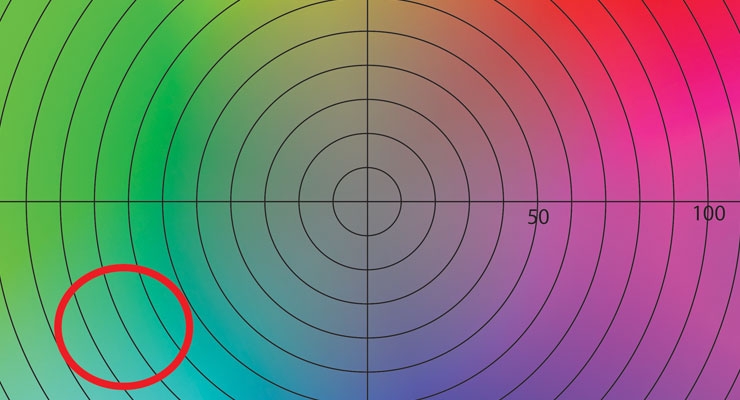
What is the approximate color with an a* value of -80 and b* values of -40? Use the image above to “plot the color”. The color is going to be a bluish green. The beauty of the Lab* or any independent color system is that you can accurately communicate the color you want by utilizing the coordinate values for that specific color. It eliminates color commentary like, “Can you blue that color up?” or “I was imagining a dirtier color.” Comments like those can mean vastly different things to each person and ultimately result in colors that are not close to customer expectations. This is why numerical expression is so important, to get agreement on the given color.
With that said, it does not mean that I will call this color “a*-80 b*-40.” Instead, this numerical digital color target, similar to a color standard in a digital form, can be easily shared all over the world, resulting in consistent expectations and color matches. Colors that have the same Lab* values should look the same. However, variables like optical brighteners, lighting conditions, and metamerism can lead to different appearances.
1. a +127 b 0 Approximate color: ___magenta_____
2. a +100 b +100 Approximate color: ___red_____
3. a +127 b -127 Approximate color: ___purple_____
4. a -80 b +76 Approximate color: ___green_____
In flexographic printing, the anilox roll is a crucial part in achieving Lab* values. The volume of the anilox roll is of the utmost importance because it directly effects the amount of ink that is carried to the plate. The anilox cell opening, in relationship to the depth of the engraving, will influence the ink release properties from that specific roll, effecting your ink film thickness (color) of the final print. If you have two anilox rolls with the same volume but different cells per inch engravings, the anilox roll with the lower cells per inch (bigger cell openings) will have an increased ink release characteristic thus resulting in a thicker ink film deposited on the substrate and a more saturated color. The thicker ink film will alter the ab* values. Many inks will hook to the right or left on the ab* axes as you increase the ink film thickness.
Now that you understand the ab* axes, let’s discuss the vital importance of the L axis. The L axis is perpendicular to the ab* axes and identifies the brightness or lightness of the color. I have heard both brightness and lightness used interchangeably to describe the axis. The numerical values for the L axis go from 0 to 100, where 0 is “dark” and 100 is “light.” I remember this by thinking about a light bulb; a 100 watt bulb is bright while a 0 watt bulb produces no light and is thus dark.
Let’s take a look at a few examples to get an idea of how this works. A color with the following values, a* = 0 b* = 0 L = 0 is in the center of the axes making it hue-less or gray. The L value of 0 tells us that, in this instance, it is on the dark side of the axis resulting in a dark gray, similar to a black. If we take another color with the following values, a* = 0 b* = 0 L = 50, it will again be a gray but because the L value is at 50 it is a medium gray. If the L value were at 100 it would be a light gray, almost white.
It is a common misconception in flexographic printing that increasing the volume of an anilox roll will merely alter the L* value. This however is not true. Yes, increased anilox roll volume will deliver more ink to the substrate thus creating a “darker” color and a lower L value. It will also influence the color itself because more pigment is delivered thus altering the ab* values as well.
Now that we understand the basic principles of the L a b* axis let’s throw some color into the mix. We have a color with a* = -100, b* = -100, and L = 90 values. Based on the Lab* coordinates, it is a light blue. If we change the L value from 90 to 10 the hue stays the same, it simply appears to be a darker blue.
Let’s put it all together and test your knowledge with a short quiz. First answer the questions below. Then match the Lab* values with the correct color block by placing the letter of the corresponding color block in the blank next to the Lab* values. Use the ab* coordinate color wheel from earlier to identify the hue and saturation of the color and then look at the L value to identify the brightness of the color.
What is an independent color space?
What color is associated with the A+ side of the axis?
What color is associated with the B- side of the axis?
What are the numerical values accosted with the L axis and what do they signify?
I hope you have a better understating of Lab* color space and see why it is a powerful tool for not only color management but also color communication. Please remember Lab* was discussed in a simplistic approach in this article to increase understanding. Without Lab* accurately communicating color, it would be next to impossible. How would you communicate that you want a color just a little bluer to someone standing right next to you? Now imagine trying to accomplish that monumental task with someone halfway around the globe – good luck. Lab* is an integral portion along almost every vital crossroads throughout the printing workflow. When you are contemplating an anilox roll change to match a color think about its impact on all aspects of the color. And next time you are in the grocery store, think about the impact that Lab* had on your shopping decisions.
Answers:
1. Magenta 2. Red 3. Purple 4.Green
1.G 2.D 3.H 4.C 5.F 6.E 7.A 8.B
About the Author
Shawn Oetjen, Midwest Technical Graphics Advisor for Harper Corporation of America, graduated from Clemson University with a BS in Graphic Communications.Oetjen possess a wealth of knowledge and experience from working in various capacities within the flexographic industry including education, production and sales. He has a keen knowledge and understanding of the flexographic process from concept to execution. Oetjen is active in various industry committees and is FIRST Level II Press operator Certified.
